Sad beige – what is it and does it matter how I decorate my child’s room?

Not too long ago, I heard the phrase ‘sad beige’ for the first time. At first, I was clueless. Did this apply to food, clothes, personality? I had no idea (and I personally have nothing against beige food – houmous, potatoes in all their guises and bread all get a big yes from me).
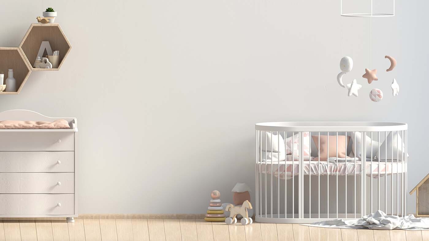
A quick search of the internet revealed it actually applied to an aesthetic. It seemed that some parents were favouring neutral-toned nurseries and toys for their children, instead of the brighter colours often associated with childhood, and dressing them in clothes dominated by colours such as oatmeal and caramel, which frankly sound delicious, if nothing else. Online commentators started talking about ‘sad, beige’ children who dressed in sad, beige clothes, lived in beige houses and were generally deprived of any joy. Which all sounded a bit much.
As someone who loves colour in a big way, I was sort of intrigued. My children are growing up in a home of rainbow rooms with red and gold toadstool lamps everywhere. I can’t think of a room in my house that isn’t splashed in colour, pattern and/or pictures (well, apart from the downstairs loo but that currently has three patterned wallpaper samples hanging up, each in the hope of being picked as the winner, so, you get the picture. No Scandi cool here).
I didn’t really know whether there was any more to this trend than taste. Is it an aesthetic choice or are these colours soothing for children? And, if so, do I need a rethink for my own brood?
In defence of beige
It’s hard to know what’s what in a world where every penny you spend on your child is hotly contested by companies marketing their toys, nursery furniture, nappy bags and children’s clothing.
So, what’s the deal? Well, it turns out the answer isn’t black and white.
For very young babies, contrasting colours are beneficial. Their eyesight is still developing, and they don’t see colour the way adults do yet. That being said, this contrast comes more from their environment, such as the faces they see and the way the light comes through a window.
For toddlers and up, it’s true to say that keeping the surroundings calm can help with attention. Learning to control attention takes time, and busy environments can make that more difficult.
We also all have different sensory preferences, and some people have sensory over-responsivity. Some children might find lots of colours overwhelming, which might lead to meltdowns and make concentrating difficult. This is why you’ll often see calming colours in nurseries.
You do you
Ultimately, your child’s response to colour is the key factor here, so be guided by your child rather than the latest trends. And in terms of clothing, dress them however they like – even better, when they are old enough, let them choose their own clothes!
How you decide to decorate your home, dress your child or choose their toys is entirely up to you. There’s enough to occupy your mind as a parent without spending your time worrying about your aesthetic choices, neutral or not. The best colours for you are the ones that make you and your child happy. And don’t buy into the Insta nurseries you see – raising children is not a neat business, so relax any unrealistic expectations you may have from seeing perfect-looking homes online. We’ll have more on this in a piece coming soon on toys and playrooms.
So, I suppose for me and my family, those toadstool lamps aren’t going anywhere for now and we’ll continue to embrace the colour and chaos!